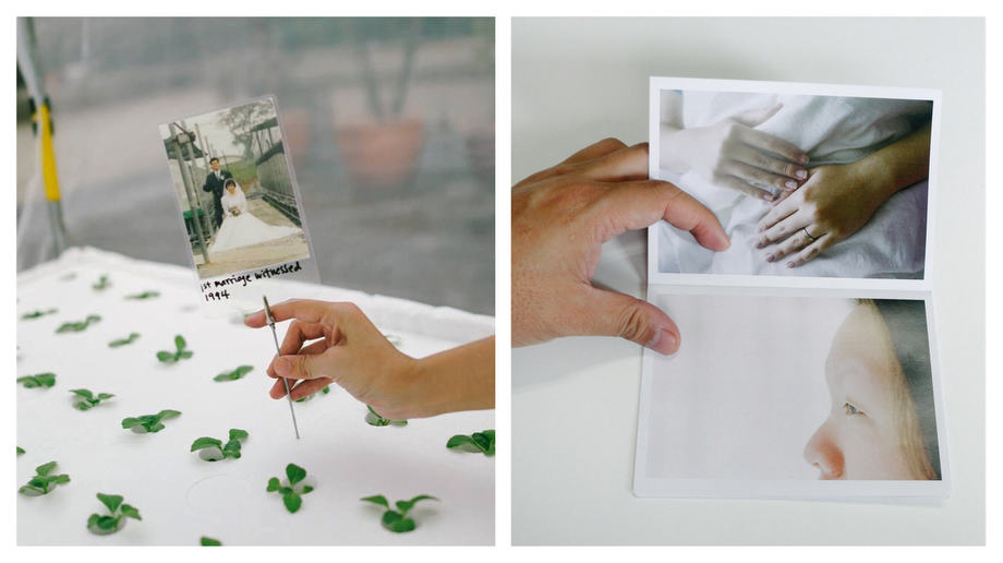
LEFT: We Are Farmers Exhibition, by Ore Huiying. Read Curatorial Notes. RIGHT: Waiting for Lele project by Zeng Liwei made during the IPA Mentorship Project.
A MILLION WAYS TO EDIT. ONE GUT FEEL.
NOTES ON EDITING BY KEVIN WY LEE
This is an expanded version of an interview on Editing Photography Projects by Fototazo with Kevin WY Lee, Invisible Photographer Asia (IPA).
Tell us a little about yourself and what area of photography you work in.
I am a Photographer and Creative Director based in Singapore. I founded Invisible Photographer Asia (IPA), a humble but well-regarded platform for Photography and Visual Arts in Asia. As an image-maker, I am primarily interested in public phenomena and identity. Aside from my own practice, I also participate in other people’s photography through editing, curation and mentorship.
This year I am the Asia curator for the PhotoQuai Biennale 2015 and a nominator for the Prix Pictet Award. I also produce a small independent festival showcasing self-published photobooks in Asia.
You can peruse my personal work here: http://www.kevinwylee.com and IPA here: https://invisiblephotographer.asia.
How do you select images to work with from a larger group? What criteria do you use?
To be a bit more helpful in the context of your interview, I’ll wear an editor’s hat and answer your questions broadly in the hope that they can find some relevance to a wide range of photographers. The accompanying illustrations are from work I have helped edited and projects from the IPA Mentorship Program.
Okay, so let’s backtrack a little. You’re ready to edit your work when you’ve amassed a whole batch of images that you have shot diligently and consistently to a theme or vision. You can be very aware of the theme/vision, or it can be intuitive insight. Sometimes photographers know, but can’t immediately articulate. It depends on who you are and how you work.
On editing. There are a few rounds of editing/selections to be done. The first round is a wide ‘kind’ edit where you respond to the images purely as images, without any bias aside from visual appeal. You can be kind to yourself and select any image you like, and for whatever reason. This will help you make that first cut.
Then you move to the next round, then the next. Each time being less kind to yourself, each time introducing a bit more bias, each time aligning the images closer to your theme and vision. One of the key things to look out for is repetition. If two or more images are saying the same thing even when they look different visually, cull them all till you get to the strongest one. Look out for patterns as well that could give you a visual thread to weave the images more cohesively. As you get tighter and tighter in your selection, the story or vision will clarify.
How many rounds of editing are needed will depend on your experience, literacy and confidence. It will vary for different people. You will also need some breathing space in between rounds to freshen your eyes. You most likely will need another objective set of eyes to help you.

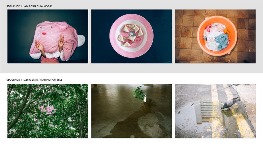
TOP: Sequence of 3 images from 05-856, by Aik Beng Chia. The pink kitty pillow morphs into a pink plate of scattered homemade sandwich cuts. The round plate is transformed to a round orange pail of wet laundry. All three, in whole and part, are a conversation on family life. BOTTOM: Sequence of 3 images for Waiting for Lele, by Zeng Liwei. The lush green is reflected in that trail of water which flows and fills a pond where the pigeon quenches its thirst.
Illustration #01 TOP: Sequence of 3 images from 05-856, by Aik Beng Chia. The pink kitty pillow morphs into a pink plate of scattered homemade sandwich cuts. The round plate is transformed to a round orange pail of wet laundry. All three, in whole and part, are a conversation on family life. BOTTOM: Sequence of 3 images for Waiting for Lele, by Zeng Liwei. The lush green is reflected in that trail of water which flows and fills a pond where the pigeon quenches its thirst.
Talk with us about how you begin to organize and sequence the images that you have selected in relationship to each other – as well as to text if there’s text. (e.g. Is it a digital process or a physical one? What kind of thoughts are part of your initial process?)
This is not easy and straightforward to answer. There are many ways to edit and sequence as much as there are different types of editors sympathetic to different types of photography. A big part of the process is informed intuition as well as logic. But ultimately everything should serve the vision of the work and importantly the purpose of the edit – be it for a book, exhibition or slideshow etc.
I guess it is healthy to mention what informs my own intuition.
- I have worked in the advertising and creative industry for a long time, working with briefs and clients. Creative problem-solving to specific goals and outcomes helps in editing.
- Secondly, I have written scripts and shot and edited films and videos. This helps in understanding linear and non-linear storytelling, storyboarding, continuity and timing concepts.
- I make photographs myself. This helps in understanding why and how a photograph was made and helps clarify intentions of the photographer.
- I have lived quite varied experiences in life with ups and downs. This informs my choices.
- Lastly, I have wide taste and sympathies so this helps in relating and referring to a broad range of photography and expression.
All of the above informs the organizing and sequencing of the images. The process is fluid and intuitive. Then you insert a little distance and logic and ask if the results are saying what they’re meant to say. You find flaws, patch them up and be fluid once more.
I recommend editing with physical prints as the process is more tactile and responsive. You can more easily make adjustments and immediately see differences, then shuffle again if required. But I also edit on screen as and when needed.
Ultimately, everything must answer 2 questions: 1) POINT? – Authorship is very important. What is the work about and what exactly are you saying? The answers will determine how to say it, that is the appropriate language and construction. Without a point and opinion, you’re merely mulling over superficialities. 2) PURPOSE? – What is the edit for? Book, exhibition, or slideshow? Who are the audience? How the audience will interact with the work should lead how you sequence and present the images.
It’s worthy to note that there is no such thing as an objective edit. We are all human, not robots, with biases and prejudices, for better or worst.

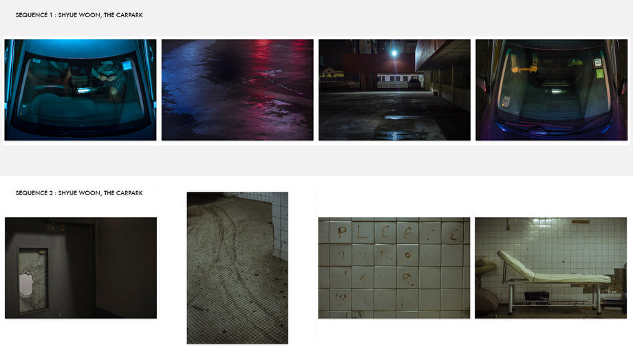
TOP: Sequence of 4 images from The Carpark, by Shyue Woon. Building fictional suggestions of an illicit affair and rendezvous in picture one followed by a god’s eye view of a tense, shadowy observer. For suggestive continuity, picture one and two cannot be arranged too far apart. BOTTOM: Sequence of 4 images from The Carpark, by Shyue Woon. Building tension and drama, followed by a suggested fate and act of passion.
Illustration #02 TOP: Sequence of 4 images from The Carpark, by Shyue Woon. Building fictional suggestions of an illicit affair and rendezvous in picture one followed by a god’s eye view of a tense, shadowy observer. For suggestive continuity, picture one and two cannot be arranged too far apart. BOTTOM: Sequence of 4 images from The Carpark, by Shyue Woon. Building tension and drama, followed by a suggested fate and act of passion.
Editing is a numbers game. The more images and range you have, the more options you have to weave a sequence.
A photo project or an essay can be viewed as an argument, and Editing is its craft of persuasion. You have a story, opinion or perspective, and you edit and sequence the images, along the way construct and manipulate conversations between images, to persuade the audience into reading your argument. Now you can argue in a loud manner or in calm whispers. Once done though, the power of interpretation is surrendered to the audience. That is the beauty and bane of photography.
It’s also important to note that there are a million ways to tell the same story. The natural tendency is to construct a linear, logical flow using traditional narration with a start, middle, and end. Much can be borrowed and learned from screenwriters’ use of index cards. Screenwriters write down every scene on index cards, highlighting key scenes and turning points, and then lay them out on a table to shuffle and edit, much like we would with photographs. The process is non-linear and great for opening up alternative ways of imparting the point of the work.
The other tip that can be learned from screenwriting is the use of a logline. A logline is a one sentence summary of what the work is about and helps guide choices made during the editing process.
With work that is about mood, visceral and meditational, without an immediately visible story, then we rely on intuition and visual senses. Pictures can be threaded together by visual cues, colour and impressions. And these form beats which make rhythm that, in turn, can be used to compose a narrative of sorts.
I previously published an introductory guide to editing which may be useful for photographers new to editing. It introduces some basic concepts. Available here: https://invisiblephotographer.asia/2013/11/18/editing101-quickguidestickies/
It’s a general starting guide. Once you get the idea and know what to do, you can break all the rules.
This Steve Jobs quote on creativity can somewhat summarise my thoughts on editing too – “Creativity is just connecting things. When you ask creative people how they did something, they feel a little guilty because they didn’t really do it, they just saw something. It seemed obvious to them after a while. That’s because they were able to connect experiences they’ve had and synthesize new things.”

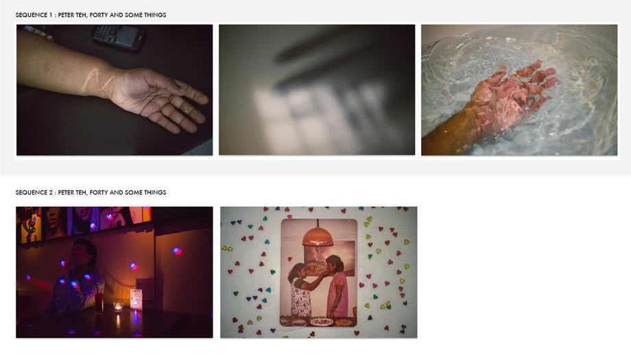
TOP: Sequence of 3 images from Forty and Some Things, by Peter Teh. The hand and diagonal lines criss-cross to form a thread and a conversation about scars, doubt and cleansing. BOTTOM: Sequence of 2 images from Forty and Some Things, by Peter Teh. The starry lights of the night bar transforms into small heart-shaped stickers in an intimate photo album.
Illustration #03 TOP: Sequence of 3 images from Forty and Some Things, by Peter Teh. The hand and diagonal lines criss-cross to form a thread and a conversation about scars, doubt and cleansing. BOTTOM: Sequence of 2 images from Forty and Some Things, by Peter Teh. The starry lights of the night bar transforms into small heart-shaped stickers in an intimate photo album.
How do you consider the balancing of formal qualities in the photographs with the content/narrative of the series as a whole as you select and sequence a series?
I have no hard and fast rule. Each work and edit is different. Everything must serve the work, it’s point and purpose. Sometimes an edit might need that one odd image to make a point.
What are common issues, problems and questions that unfold for you during the process of laying images out?
There are different issues for different layouts.
If you’re laying out for a book, then paper, size and form of the book are issues to be addressed. Which images need to be paired or singled out? When to insert a blank page for breathing space? Should this image be cut across the page gutter? Portrait or landscape book? Matt or coated stock and what weight?
If you’re laying out for an exhibition, then how do we predict traffic and how audiences are going to move from wall to wall. What distance are they going to view the images? What’s the first image they see and should that be bigger?
How do you know when a layout is done?
An edit and layout is never absolutely done or finished. You might return to it later and re-imagine or re-interpret the work. Or you might not.
Years after you pass, a curator or an archivist might revisit and re-interpret your work according to the relevance and appreciation of their times. An archivist might dissect and strip off all sentimental value and reframe the work as straight historical documents, the curator might recalculate the work’s art and aesthetic value.
This quote in our interview with Malaysian Curator Wong Hoy Cheong on Ismail Hashim’s archive is a good note in this regard.
“I want to lay open the complexities of archiving and lay open our own inadequacies and that an archive is never finished. French philosopher Jacques Derrida said the moment you finish archiving or you close an archival system, it becomes totalitarian. An archive should be constantly opened to new interpretations and creation of new archives.
In this section, I also hope that we make it clear that photography equals archive. A photograph is an archival document. If you look at photography, meanings change over time because photography is only located within time. The moment it is removed from context, its meaning shifts.”
What are common mistakes you see in editing?
1) Not knowing what to say. Often, the more novice photographer doesn’t know what he wants to say with the work. This needs to be clarified before any meaningful edit can be done.
2) Saying too much. Often we try to say too much with the work, especially very personal ones, and end up saying nothing because the narrative and sequence is too confusing. It is better to be concise, focus on one main point and amplify that.
3) Language, tone and delivery. Sometimes, it works to the work’s advantage if the edit and sequence is more subdued and consistent in that tone.
4) Repetition. I repeat. Repetition.
5) Getting too emotionally attached to particular images which don’t serve the edit.
6) Not enough images to edit.
Finally, what is the best advice you’ve ever gotten about editing?
There are two.
- There are a million ways to edit but only one gut feel.
- Don’t ask James Nachtwey to edit your Sakura Flower pictures.
Share

Comments 4
great advise and article
A Very good read
It is really a great and helpful piece of info. I am
happy that you shared this helpful info with us. Please stay us informed like
this. Thanks for sharing.
Editing can concern either the readjustment of single image values or what meant in your article.
About advices, a good one is:
Just choose good images